


Brand Identity
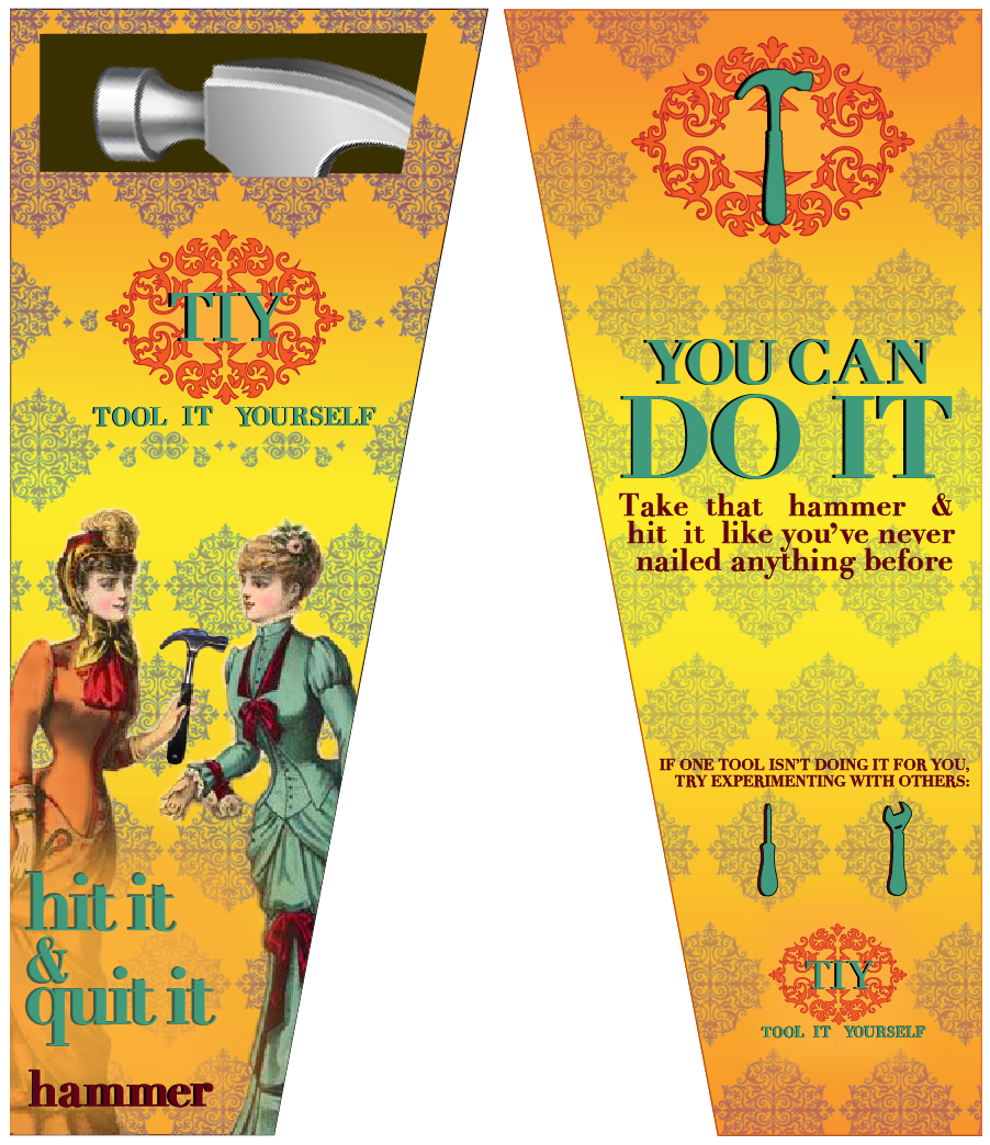
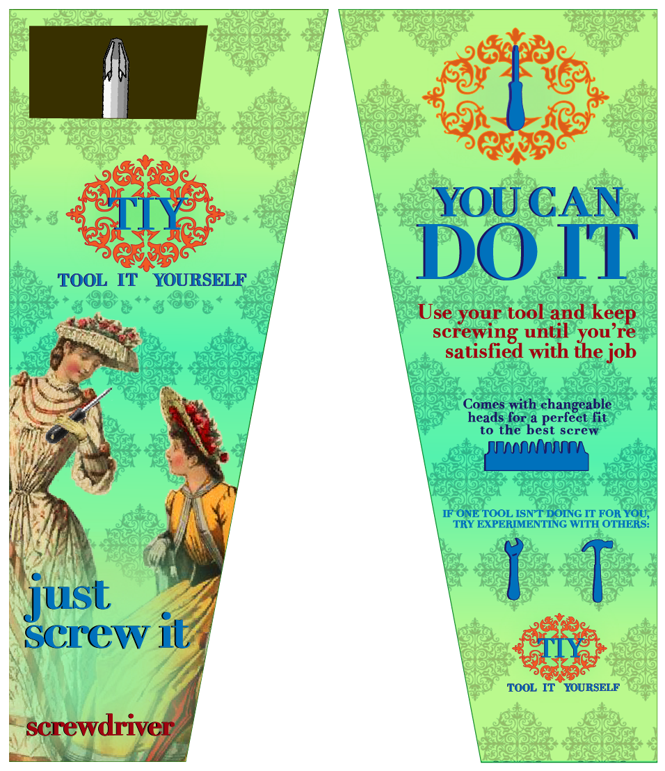
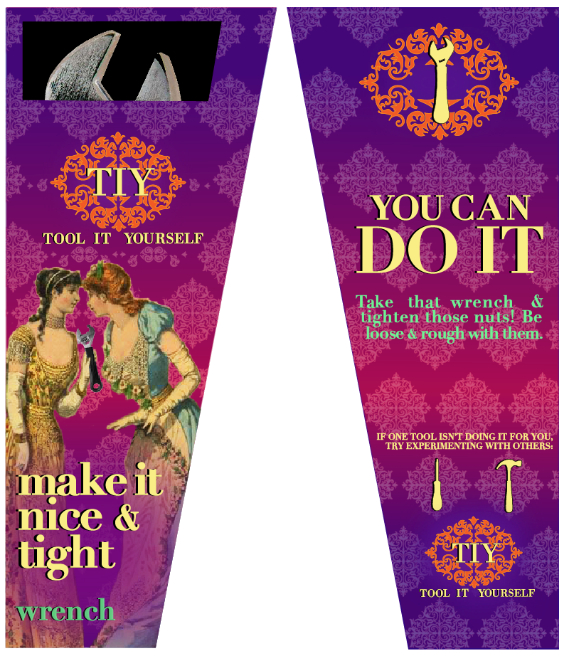
Women who are looking for a funny gift idea for their friends or simply a fun treat for themselves, while being able to use the contents inside the packaging for a quick project at home. Though the copy on the body is comes off strong sexually, the elegance of the 1880’s French influence and bright fun colors, balance it out, creating a fun package most women wouldn’t want to throw away but rather keep it to store their tool in.
Target Audience
This line of tools will be sold at gift stores such as Francesca’s, Papyrus and Paper Source. Businesses like these will have this line of tools available for purchase of around $15-20 as a fun quick gift for friends to give to one another. These products appeal to women ranged from 20-55+ years of age.
Design References
The typeface Didot was used for this product because it is a clean and simple typeface that represents the simplicity and elegance used in old time newspapers, which relates to the 1880’s French theme used throughout the PDP. The colors used throughout each tool is a highly saturated hue mixed with a gradient to grab the consumer’s attention, as well as have an aesthetically pleasing look and feel to it. The gold lining inside the box and on the handles of the tools represent an elegance and a sense of achievement like a “gold medal” for accomplishing the use of the actual tool as well as physically with your romantic life. The cartouche and drawings of the French women from the 1880’s is used to create a sense of elegance with a topic that can be a “taboo” for some, making it chic and witty. The shape of the box is a unique design to stand out from the shelf, and for the consumer to pick it up and start reading the box, with the intent of wanting them to purchase it.